Thursday, September 30, 2010

Franziska Windover, Pencil Artist

Franziska Windover
The calm of early morning coupled with soft strains of music, is the perfect time for this self-taught artist to invoke her creative spirits by consecrating pencil and paper. It is then that the sensitivity towards the subject of her sketch, becomes revealed by the capture of detail in the most skillful manner. Utmost respect for texture, depth and shading combined to bring to light, a most accurate representation of the imaged penciled.

I came to know Franziska through AIM (Artists in Motion) in the nearby Village of Marmora. Franziska's magic with a pencil has earned for her a solid reputation, with commissions, her appearance at Ontario's prestigious Buckhorn Arts Festival, her local showings, and her work for the arts at the community level. And, just to add a bit of spice to the pot, Franziska is also a mom, and office administrator.

The exciting thing about Franziska or, 'pencil' as she is affectionately nicknamed, is that she she can always manage to find a little extra time for art in her community. On one visit into our local cooperative art shop,'Pencil', was blending her service to our art group in managing the shop, with trying to work her way through her deadline of producing enough works to take to the Buckhorn Art Festival.

I will drop one of Franciska's works into the blog tomorrow for you to see the kind of skill this lady has.

Tuesday, September 28, 2010

Another art form.


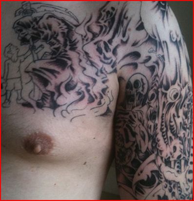
I couldn't resist it. They say that beauty is all in the eye of the beholder.

The world has changed and its either time for me to get with it or move aside and let the herd rush past.

There was a time as a kid when I would have given my one finger off my drawing hand to have had a tattoo. The only thing that stopped me is the fact that I was afraid my father would forget to stop beating me.

Now a days even women have tattoos.

Have you ever wondered what would happen to that little butterfly if that sweet little thing doesn't diet and the butterfly keeps on being stretched to the limit.
If or when she gets old and shrinks and gets thin, will the buttefly encase her?

I have to confess that more often then not, every time I look at someone wearing a tattoo, I have to stretch my imagination to see beauty in them. But then again...beauty is in the eye of the beholder.

It is sometimes written that art is the closest form of human expression you can get to spirituality. Does that tattoo I see with a knight slaying a dragon, represent some kind of spiritual warfare?

The biggest tattoo I could remember seeing as a kid was a hairy chested man with a big clipper ship on his chest. The most common one was likely a simple anchor on a bicept. What would mother have thought if she knew that the leather warrior on the Harley, remembered her with a tattoo?

Is it true that our outer world is representative of our inner world? Or in more simple terms, does our external image represent our internal lanscape?

An internet search online revealled that there are conventions and special week conferences for those who are into such things. Oh well. Life goes on. When did I miss the boat?

Monday, September 27, 2010

Gone Fishing

Well..not quite. The truth is, my computer is in being serviced. Come back tomorrow for the posting listed on the right column. The fish will be fried and dinner served up at the end of the month, when things return to normal.

Sunday, September 26, 2010

Should You Watermark Your Art. Why I don't by Angela Fehr


Angela Fehr is a Canadian watercolorist raising her three small children in northern British Columbia. Primarily self-taught, her paintings celebrate the simple beauty found all around.

Though I don't write a lot on this blog these days, (Angela's blog) I have lasting traffic and content from artists who have found useful information in past entries, especially those pertaining to art business. I like that, although it sometimes feels a little funny to get questions from other artists who think that they are asking an "expert" - I'm really just a girl who's done a lot of research when it comes to art business and marketing. And having a web presence. Because everything I do on the web is DIY, I have learned by doing...and there's a lot of "what not to do" under my belt, believe me!
Recently I received an email from an artist who was asking my opinion on whether or not to watermark the pictures of her art that she posts online. It's a good question, and one I researched before deciding not to watermark my work. It's not a decision everyone may agree with, but in my circumstances, I don't believe watermarking is beneficial, and in fact I believe that were I to watermark my paintings, I would do so to my detriment.

Example of a watermark

Why would you watermark your art? Well, there is some concern about image theft. It's a pretty simple matter to save an online image onto one's hard drive, and ignorant or unscrupulous people may then consider themselves to own that image, and use it freely without compensating the artist. I have heard stories about artists who found their painting in a book or on a web site, under another artist's name. That's worst case scenario, and some artists do plaster their art with watermarks so as to avoid having their art digitally "stolen."

However, I believe that this type of theft is rare, and can be largely prevented without emblazoning one's art with distracting and obtrusive watermarks. Because watermarks are distracting. They interfere with the viewer's enjoyment of the art. My mom won't look at my paintings unless they are framed - she says that the masking tape I use to secure my paper to the painting board is too distracting - I can't imagine how she'd manage with watermarks to divert her attention! I don't want to lose a buyer because he couldn't see my art for the watermark.

My solution to avoiding watermarks is to instead be very careful about what I upload to my web site. I never upload a full resolution image of any painting. Instead, I reduce my image sizes to 600 pixels wide, decrease the resolution of each painting to 72 or 96 dpi, which is all a computer monitor requires, but renders the image too low resolution to print in any kind of quality. While this will not stop anyone from saving one of my online images, they aren't saving a printable version. I'm flattered if someone wants to save one of my images to their desktop or screen saver - that's a compliment and is actually a little free publicity. It takes only a few steps to reduce image size and save it to publish online, by now it's a habit for me.

Now there are some artists who have done their own research and have chosen to use watermarks. And they have very valid reasons. Some artistic styles and disciplines have more trouble with image theft than others. But it's not necessarily the best option, and I encourage you to research the issue if you are concerned about it, and come to your own conclusions.

And as for my scrapbooking blog, I'm seriously considering using watermarks - in that field it's very beneficial to have some sort of personal credits on papercraft projects.

Please click here to be taken to Angela's blog,

Saturday, September 25, 2010

Gone Fishing

Well..not quite. The truth is, my computer is in being serviced. Come back tomorrow for the posting listed on the right column. The fish will be fried and dinner served up at the end of the month, when things return to normal.

Friday, September 24, 2010

Zoltan Szabo - Taking it to Limit


Like many watercolourists, my entance into painting was guided by the hand of Zoltan Szabo. Not that I ever knew the man, but his instructional books counted among my favourites.

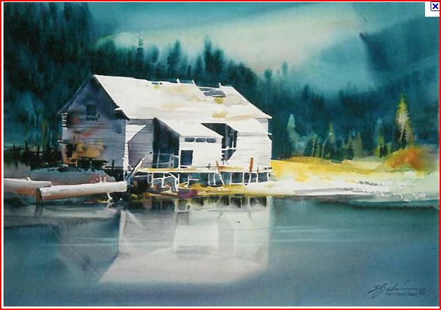
The above picture is one of many of Szabo's classic works. But, then again there are many who would say that almost all of his works were classics.

Let's take a close look at this painting. This work is an excellent study in values, and in simplicity of style.

The central subject in the work is the sunbathed cabin. Zsabo is a master of making colour work to his advantage, and he does it in part, by his firm knowledge of values.

The cabin achieves its drama not just because it is largely, unpainted white paper - but because 98% of it is surrounded by dark values. Contrast drives the white dramatically forward into your focus. And, if that isn't enough...the darkest values of all, are from the shade inside the cabin, and under the deck and from shadows, and here again we get the power of contrasting values. As the old laundry detergent jingo used to go..it all makes the "whites whiter than white".

The next thing about this work that catches my eye is its simplicity. There's not a lot of subject matter in this painting. There's the forest, the sky, the field, the lake and the cabin. He paints his sky first, then pulls the trees up into the nearly dry paper where his paint runs a bit and creates an intentional blur rending the forest undefineable. It's little more than the dark background canopy hanging from the back of the stage.

The sky is also a wet on wet exercise in simplicity. A couple of background swipes laid over a mixed wash. The dark shape on the upper right side of the page is a throw away. It's purpose is to box the picture in, and force your eye to look to the left.

That being said, we are left to look at the cabin and its reflection in the water.
There is a quote in the Bible of looking "through a glass darkly". Well, in this case the water mirrors the cabin. I would argue that because it presents an alternative, and a less than perfect replication of the cabin - the cabin's presence is strengthened for the third time. Without thinking much about it, the observor is really seeing a cabin twice the size it is. And since the reflected cabin is a little less distinct and a little darker, the actual cabin is intensified once again - this time by its own darker image.

Zsabo had a firm understanding that stength lies in simplicity. Complexity and visual competition of focus, distracts. Simplicity tightens the field of vision.

Not only do we see a painting of 5 elements; sky, forest, field, cabin and water
but we see Milton using a tremendous economy of brush strokes. Most of the painting that surrounds the cabin is painted with pretty simple washes.

The real close in brush work in this work is around the cabin, with its posts and porch, uprights, roof joists, and side boards.

The final element of simplicity worthy of note, is the power of his limited palette. This entire work is painted with variations of blue touched off with a few splashes of yellow tones. But looks at what he achieves! We find here the tremendous dominance of value over colour.

As they say in France, "All Roads lead to Paris." Step back from this work, and look at the sky the painter, puts a slash of light in the sky and this comes down almost to the right roof, and it is picked up again by the white cabin and dropped down into the reflection in the water. This simple slash in the sky puts the cabin inside a major path of whiteness. And if that isn't enough, another road of unpainted whiteness run along the shore up to the cabin's deck.

So here it is; Zoltan Szabo's art at its best. He knew how to make a little go a long, long way.

Thursday, September 23, 2010

Gone Fishing

Well..not quite. The truth is, my computer is in being serviced. Come back tomorrow for the posting listed on the right column. The fish will be fried and dinner served up at the end of the month, when things return to normal.

Wednesday, September 22, 2010

Nisga Art Repatriated: "The Spirit of our Ancestors Returns Home".


This picture is sure to grab the attention of any lover of the visual arts. Its a work by a member of the Nisga Nation, on Canada's West Coast.

The column below was taken from the Ottawa Citzen, via Google and the Montreal Gazette. (Good stories make the rounds don't they?) It was written by Bruce Ward of Postmedia News, on Sept. 11, 2010. The photograph was also sourced from Postmedia.

Nearly 300 historically significant Nisga’a artifacts collected in central B.C. in the early 20th century — some described as “masterpieces” of native art — are to be repatriated next week by officials from two major Canadian museums.

The Nisga’a Nation will make legal history this week with a ceremony marking the return of about 300 cultural artifacts held by the Canadian Museum of Civilization and the Royal British Columbia Museum.

For the first time, repatriation of artifacts was negotiated under the terms of the Nisga’a Final Agreement, signed between the British Columbia government and the Nisga’a 10 years ago. The treaty grants communal self-government and control of natural resources to the Nisga’a in their corner of northwestern British Columbia. It also sets out a process for the return of cultural and heritage items.

“This is the first time transfer of artifacts has happened like this through the treaty,” said Martha Black, a curator at the Royal British Columbia Museum in Victoria.

“It’s very exciting. It’s a real landmark because it’s the first modern treaty, and for what it means to the Nisga’a people and the people of Canada.”

The artifacts — 121 items from the Museum of Civilization in Gatineau, Que., and 155 from the museum in Victoria — are being trucked to the Nisga’a Museum in Greenville. B.C., about 100 kilometres from Prince Rupert, in time for the ceremony on Wednesday.

But even avid museum goers in Ottawa are unlikely to miss any of the items transferred because few were on display.

No totem poles or other exhibits in the museum’s Grand Hall are being returned, said Moira McCaffrey, who oversees the museum’s artifact and archival collections.

Most of the items going to the Nisga’a Museum are related to shamanistic and healing rituals, she said.

Among the items are rattles, whistles, small charms and carved amulets.


For the past 25 years, the Museum of Civilization has been working with community groups asking for repatriation of artifacts. Most requests have come from aboriginal communities.

In 1978, for example, the museum returned confiscated potlatch items to the Kwakwaka’wakw communities of Alert Bay and Cape Mudge. The museum has also returned wampum to the Six Nations Confederacy and medicine bundles to the Plains communities.

It has also returned human remains to several First Nations.

Many of the items being returned to the Nisga’a were collected by British-born ethnologist Charles Newcombe, who visited villages throughout B.C. during the early 1900s. Many items amassed by Newcombe were eventually added to collections in museums around the world.

McCaffrey said that many museums now recognize that historically significant artifacts were never meant to leave First Nation communities.

She said the museum’s negotiations with the Nisga’a were respectful, and a learning process for both sides.

The Nisga’a ceremony, titled “The Spirit of Our Ancestors Has Returned Home,” will feature cultural dancing and a tribal picnic.

The event will be webcast, adding a modern touch to the traditional rituals.

Ottawa Citizen


All that being said, lets take a look at the work above. I could easily call it 'Eyes Wide Open'. The face is surrounded like the roof and walls of a longhouse. I can imagine it, for instance as a great painting on the end wall.

It is human in features, but in other respects it has an all seeing, spiritually representational look.

The wide staring eyes lack any sense of individual recognition. They look beyond the singular and they see all.

In some respects it resembles a death mask, for the features are caught in the rigidness of a frozen moment of time. The blank eyes remind me of the Moon Mask, I once saw in Victoria. But there is much more to this, for the Moon Mask was as flat and as formless as the face of the moon.

This is the kind of mask I would expect to find if I was on an archaelogical dig at the grave of a great leader from a long gone, great society.

Explications of the meaning of Native Art fall short of the mark, since the majority of non natives, and possibly even the majority of natives living today, lack the insight into the cultural nuances of artistic symbolism enjoyed by the artist.

One thing for certain, is that the Nisga people will most certainly rejoice at being able to once again experience the profound sense of awe and mystery which I see in it, only this time it will have returned home.

Tuesday, September 21, 2010

Gone Fishing

Well..not quite. The truth is, my computer is in being serviced. Come back tomorrow for the posting listed on the right column. The fish will be fried and dinner served up at the end of the month, when things return to normal.

Monday, September 20, 2010

Ron Morrison on Vertical Painting in Watercolour

Once Upon a Time

Ron Morrisson of Courtenay, BC changed his method of painting. Like most watercolourists, Ron painted his works on a flat sheet. Ron recently wrote
"I started painting this way after watching Castagnet. I found the transition relatively easy after all these years of flatitude. I have also started using very big brushes. Z'bukvic is always talking about following the "bead", the bottom of the wash as it moves down the paper.The combination produces greater transparency. I found that I lost some of my "effects" as the paint waves down the paper, such as granulation and some texturing but overall I liked the process. What the whole program does is force you to deal with keeping your hands off the paper, paint with the tip of the brush to get your finework done and paint fast. You have to actually paint without support or aid (I suppose you could use a stick thing) and occassionally mop up as the paint runs down the paper."


When we take a good look at Ron's 'Once Upon a Time' above, it may not be readily apparent for many viewers that we are seeing a vertically painted picture.

Let's take a good look at this work. How can it be? What is happening to my perceptions when I look at this work? When I look at this painting it seems to me that Ron has not just bridged the chasm between technique and finished product but this work looks like technique itself. It looks like a frozen cameo taken from an developing scene. Quick now, where did I put the phone number for the national Gallery of Canada?

I've been critiquing Ron's work now for about 3 years, and I've got to be upfront now, its important when you look at this work to realize that Ron's change in technique, is taking Ron out onto a limb. His works are different. They have always been confined by flow and backflow, blossoms, and dramatic interplays of values and colour. But, as Ron says above, the vertical technique comes without some of his perfected 'effects'.

The flow in this work entreats my imagination to think that I am looking at this scene, through a rain streaked window. I am gobsmacked to think that someone can actually duplicate such an image.

It also presents quite an unintentional comparison with Milton Zsabo's preceding work. There are differences and there are similarities.

Ron's palette is restricted and his subject is limited to a few basic elements: trees, sky, house and foreground car. Ron's liberated immpressionism encourages the viewer's freedom of imaginative inreading. Look at the sky for instance. Do we see clouds and light or do we see clouds, light and mountain shapes? Look at the foreground on the bottom left...does it suggest to you chaotic littering? Ron has always been a master of such technique.

Sometimes in art its not what you see, but what you think you see. Sometimes its not the picture but the mood created by the picture. Can the artist use his/her skill to fasciliate inner vision and imagination? Can the impressionist, help you see the inefferable mystery of that which is within a subject? I would argue that its infinitely harder to be an impressionist than to be a small brush, controlled literalist. And Ron demonstrates his willingness to step out onto an artistic limb and to change his style. I respect his artistic voyeurism and adventurous spirit.

To visit Ron's website please click here.

Video's of Alvaro Castagnet painting in the vertical style can be found on You Tube.

Sunday, September 19, 2010

Gone Fishing

Well..not quite. The truth is, my computer is in being serviced. Come back tomorrow for the posting listed on the right column. The fish will be fried and dinner served up at the end of the month, when things return to normal.

Saturday, September 18, 2010

1965 CBC Television Interview with Frederick Varley


A visit to Frederick Varley
Broadcast Date: April 20, 1965

Frederick Varley is unique among the members of the Group of Seven. He's celebrated for his skill as a painter of portraits rather than the moody landscapes that typify the Group's output. In this excerpt from the CBC TV series Other Voices, Varley discusses his approach to painting friends and commissioned portraits. Artist John Nichols pays him a visit and learns that Varley refuses to paint someone if they're too beautiful.

To view this CBC television interview with Frederick Varley, please click here.

Friday, September 17, 2010

Gone Fishing

Well..not quite. The truth is, my computer is in being serviced. Come back tomorrow for the posting listed on the right column. The fish will be fried and dinner served up at the end of the month, when things return to normal.

Thursday, September 16, 2010

Eagle Human Transformation


Video from Bingorage Production Studio.
For additional information on the art of Eric Kest, please click here to be taken to bingorage.com.

Wednesday, September 15, 2010

Gone Fishing

Well..not quite. The truth is, my computer is in being serviced. Come back tomorrow for the posting listed on the right column. The fish will be fried and dinner served up at the end of the month, when things return to normal.

Tuesday, September 14, 2010

Bill Mason, Cinematographer and Artist


"The forest that God created inspires me to create a painting that I hope reveals how I feel about it. That's what creativity is to me."
Bill Mason,1929-1988


Bill Mason,1929-1988.

Bill Mason's painting technique

He lined up various colours of oil paint he might want on his glass palette for that day. Taking his small palette knife he mixed about five shades of colours. Then he took each mixed colour and piled them carefully one on top of the other. Lifting the large blob of layered paint from the glass he then scraped it across the surface of his smooth paper once. For the next palette knife stroke he'd start his mixing process all over again preparing for the next application to the paper.

Becky his daughter remembers being amazed how haphazardly the paint appeared to be applied and yet could still create a detailed painting. Bill felt he had a bit of a dilemma in his painting style. He couldn't seem to paint larger than six inches and maintain the loose, free style he liked. Some of his best paintings range in size from one inch square to six inches square.


Extracted from Red Canoes.ca. Please click here.

Monday, September 13, 2010

Toronto International Film Festival.....A Premier Act


David Szusuki at the Toronto International Film Festival


Location Toronto, Ontario, Canada
Hosted by Toronto International Film Festival Group
Number of films 300 - 400
Language International

The Toronto International Film Festival (TIFF) is a publicly-attended non-competitive film festival held each September in Toronto, Ontario, Canada. The festival begins the Thursday night after Labour Day (the first Monday in September in Canada) and generally lasts for ten days (although the 2010 festival is eleven days). Between 300-400 films are screened at approximately 37 screens in downtown Toronto venues. Total attendance at TIFF has exceeded 250,000 in the last few years, with figures from the most recent 2009 edition at 287,000 for public and industry admissions and a further 239,000 from the free programming scheduled at Yonge-Dundas Square.[1]

Founded in 1976, the TIFF is now one of the most prestigious film festivals in the world. In 1998, Variety magazine acknowledged that "the Festival is second only to Cannes in terms of high-profile pics, stars and market activity." Quoted by the National Post in 1999, Roger Ebert claimed "...although Cannes is still larger, Toronto is just as great...." In 2007, Time noted that the festival had "grown from its place as the most influential fall film festival to the most influential film festival, period."[2] It is the premiere film festival in North America from which the Oscar race begins.

The festival was once centred around the Yorkville neighbourhood, but the Toronto Entertainment District has now overtaken Yorkville in its importance to TIFF.[3] The festival is known for the celebrity buzz it brings to the Yorkville area with international media setting up near its restaurants and stores for photos and interviews with the stars. With the Fall 2010 opening of the Bell Lightbox,[4] the festival's permanent home in the Entertainment District, it seems likely that the festival will increasingly spread out from its traditional centre to embrace other locations in the city.[5] Content-wise, though the festival has begun to give more attention to mainstream Hollywood films, it still maintains its focus on independent cinema. It features retrospectives of national cinemas and individual directors, highlights of Canadian cinema, as well as a variety of African, South American, and Asian films.

The festival is considered the launching pad for many studios to begin "Oscar-buzz" for their films due to the festival's easy-going non-competitive nature, relatively inexpensive costs (when compared to say European festivals), eager film-fluent audiences and convenient timing.[6][7][8] In recent years, films such as American Beauty, Taylor Hackford's Ray premiered at the festival and garnered much attention for Jamie Foxx's portrayal of Ray Charles (for which he ultimately won the Academy Award for Best Actor); and Slumdog Millionaire, that went on to win 8 Oscars at the 2009 Academy Awards. Precious, which won the 2009 People's Choice Award at the festival, went on to win 2 Oscars at the 2010 Academy Awards.

The Director and CEO of the Toronto International Film Festival has been Piers Handling since 1994. In 2004, Noah Cowan became Co-Director of the Festival. In late 2007, Cowan was promoted to Artistic Director of Bell Lightbox, the Toronto International Film Festival Group's (TIFFG) future home, while long-time programmer Cameron Bailey succeeded as Co-Director.

Extract from Wikipedia. Please click here.

Please click here to be taken to the TIFF, webpage.

Sunday, September 12, 2010

In Praise of Small Galleries


I am a big fan of small galleries. The are often the first home for artists. (myself included) and, they bring creative sparkle to the Ontario countryside.

Let me tell you about two such places.In the picture below you will see 'mamma bear'(Mrs. Fredericks) chatting it up with Ernie Pattison. Ernie runs the Old Schoolhouse Tea Room in Ormsby Ontario, and his brother Gary along with Lillian Oakley operate the Old Hastings Gallery.

The Pattison brothers are both twins and professional musicians. They have made their careers in Toronto and in later years have migrated back to their roots around Ormsby.

Funny how talents run down through families. Intriquingly, Joni Mitchell and the Pattison brothers share the same grandmother. Joni dedicated her song "Clouds" to this departed lady, and when you go into the Ormsby schoolhouse you can read of this story complete with seeing a picture of the old one.


Small town galleries are loaded with local charm and they profile the best of local art.


Lillian tells me that the local artists Gallery Room is a work in planning and in another year she expects to see it complete with paintings created by regional artists.

For the geographically challenged, Orsmby is a small village south of Bancroft, and North of Madoc. We chanced upon it, after taking an Ontario Ghost Towns drive.

If you wish to visit the Orsmby Old County Gallery website (with the tea room represented on one of the pages within), please click here.

Saturday, September 11, 2010

Another Iconic Image


Artist: Krista Hasson

As I child growing up, railroads made a great impact in our country. The image of huge locomotives represented the dynamic power of a country on the move. There was even a time when an artistic image of a great locomotive was on the face of one of the paper currencies.

Then, as time passed, the role of the railroad began to decline, and Canada searched for other images - space arms and CN towers.

Here we find, artist Krista Hasson capturing the image of the railroad in decay. Her painting is not just a statement of the times but its a solid representation of life today.

To see this image and other's on Krista's website, please click here.

Or you may wish to check out Krista's blog at this link.http://whatskristapaintingnow.blogspot.com/

Friday, September 10, 2010

Paul Duff - A Foremost Canadian Painter


Even though I was officially recognized by the National Gallery of Canada in August 1956, you won't find me in the popular anthologies of painters. In fact, I was once referred to as one of Canada's 'best kept secrets'.

It was Group of Seven artist A.Y.Jackson, who advised me to seek my validation as an artist abroad - Canada was slow to recognize good painters, he said. So, in 1952, I left for Rio De Janeiro, armed with my box of paints and brushes, a teacher's certificate, and $1,200. While abroad I was made an honourary citizen of Rio de Janeiro and I was invited to exhibit in Brazil's national gallery. My work was also placed in private and public collections in several other countries.

When I returned to Canada in 1981, I discovered rather dramatically that my career was unknown here. To complicate matters, I has settled into a community that viewed signed prints as art. My passion and duty was to paint, just as a poet creates poetry, a writer his novel, or a composer his music. I had to escape that market at all costs.

In 1988 my wife Leila and I fell in love with Ontario's Bruce Peninsula. We built a log home, set up a studio and tranformed a century old cottage into a gallery that has become popular with young artists. So much so, I felt obliged to write a book, which is now used by fine arts students at college level about how to remain true to your creative talent without starving to death. Its called, 'The Eternal Apprentice,' - an apt title I thought for a title penned by a Hamilton born painter living contentedly on the edge of paradise.


Source: Our Canada Magazine, pg. 56, April/May, 2007.

Fredericks-Artworks Blog, copying policy


The Canadian Copyright act, section 29 reports on fairdealing, that it is not an infringement to reproduce someone else's work for research, study, criticism, review or to report. Which pretty much sums up what this site is about. All content sources, be they artists, printed references, and website url's are respectfully identified on this site. http://http//www.canlii.org/en/ca/laws/stat/rsc-1985-c-c-42/latest/rsc-1985-c-c-42.html

Mission Statement
A Portrait of the Visual Arts in Canada, is intended to celebrate the richness of Canada's visual arts, and to promote the arts in Canada.

Statement of Intent
I make every effort to credit the sources of information used in this blog and to obtain the permission and cooperation of all the works presented by living artists. I try, as much as possible to use works from public sources eg. national and provincial collections, of deceased artists. If for any reason, any artist disapproves of anything written about them or their work the artist is encouraged to request withdrawal of the content.