Saturday, December 29, 2012

Suzzane Rivard Le Moyne, the Passing of an Art Visionary


When an institution becomes fundamental to a culture's creative well-being, we easily forget the vision and determination needed to create it. The people responsible for the extraordinary support the arts enjoy today often remain hidden from view, and many prefer to let their achievements speak for themselves. Especially if, like Suzanne Rivard Le Moyne, you deeply believe this should be so.


Our present art world owes much of its vitality and strength to this singular individual – a rare combination of artist and administrator, visionary and pragmatist. The achievements of Suzanne Rivard Le Moyne stretch from coast to coast and cover more than 50 years. From the creation of the Canada Council's Art Bank, to new programs for emerging art forms, to innovative university programs, Rivard Le Moyne has touched all of our visual culture. As Victoria Henry, current Art Bank Director, says, “everything she did made a difference.”
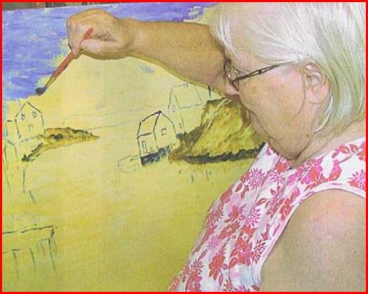
All of these remarkable accomplishments have a very particular source: Rivard Le Moyne is first and foremost an artist. Her strength and conviction, which have guided her as teacher, innovator and administrator, spring from the understanding and intelligence of the artist.

Suzanne Rivard was born in Quebec City. She received her fine arts diploma from the École des beaux-arts in Quebec. In many ways she was going against the grain of her milieu. She was a very young artist when she began teaching there and, a few years later, at the École des beaux-arts in Montreal. During that period she spent summers in Europe and a very productive two years in Paris, unusual for a young single woman at that time. Her painting career took off, and she exhibited regularly in Montreal and Paris, winning prizes and awards. She was a passionate teacher, and in her 25 years of teaching she enriched the lives of more than one generation of artists: “I have always lived and worked with, and among, artists. As a studio professor, I had the privilege to have young students such as Yves Gaucher, Jacques Hurtubise, Roland Poulin, Pierre Ayot and several others who later became very well-known.”1 Roland Poulin would later comment: “She stood out from the other teachers. She was the first woman I met who engaged with me intellectually.… It was very exciting to be in her class; she was strong, articulate and well-informed, and always ready to debate ideas.”

Rivard Le Moyne might have comfortably remained an artist and professor, but a different path presented itself. In 1969, her husband, the late writer Jean Le Moyne, was asked by Prime Minister Pierre Trudeau to join him as adviser and speechwriter. Rivard Le Moyne left her productive studio in Montreal for a new, unknown life in Ottawa. She was soon asked to bring her experience of the arts to the Department of the Secretary of State, where, under André Fortier, she worked on cultural policy and special projects. Shortly after, she moved to the Canada Council to become head of visual arts.

She says of this precipitous move: “Coming to the Council … I had no experience in administration, except for a few months at Secretary of State. I had never sat behind a desk. I was an ‘apprentice administrator.' ”2 But, as Dale McConathy has noted: “She was an artist, and she had a way of asking questions.”3

Rivard Le Moyne says: “That ignorance was both a handicap and an advantage. A handicap because I had to learn quickly…. It was also an advantage: ‘Innocence is bliss,' as Pierre Théberge said with humour when I invented the Art Bank. At best, innocence can give someone a fresh, non-conventional outlook that sometimes experts tend to lose with time. A capacity to analyze and evaluate the ‘usual way of doing things,' to upset them, or propose new, unexpected ones.”4

When she began at the Canada Council, the arts were in a period of expansion and flux. The Council had become the catalyst for this exciting scene, and in her action-packed four years there, Rivard Le Moyne would revolutionize the visual arts section, expanding its role for both artists and public alike.

Rivard Le Moyne knew how diverse the arts had become through the turbulent and stimulating 1960s. Aware of the needs of new practices, she instigated new programs for film, video and photography, which until then had been obliged to compete with the more established disciplines. This was to nourish flourishing, internationally-acclaimed activity in these media. Having come through the system as a young artist, she also knew that there were few venues for younger artists to exhibit work, especially for the rapidly growing areas of installation and performance art. Her ingenious solution was the establishment of a system of artist-run centres, the parallel galleries so familiar to us now. Her own experiences as an artist in France led her to seek recognition abroad for Canadian artists: she conceived and organized Canada Trajectories 73, a major exhibition of Canadian artists in Paris.

“But the best was yet to come,” according to Tibor Egervari, current Chair of the Visual Arts Department at the University of Ottawa.5 And that was the Canada Council Art Bank, which celebrated its 30th anniversary on February 5, 2002. This extraordinary institution was the invention of Rivard Le Moyne. Timothy Porteous, Associate Director of the Council at the time, says it was “first of all, a feat of imagination, since no model for it existed. It was a test of ingenuity, since it required the approval of the Treasury Board, not usually known as patrons of the arts. It also called on Rivard Le Moyne's determination in overcoming an array of skeptics, diplomacy in finding allies in the public service, and sound judgment in resolving sensitive policy issues.”6 Quite a feat for an ‘apprentice administrator.'

Rivard Le Moyne called her idea “un reservoir” for art. She had been intrigued by the enthusiasm among Council staff for its own collection (put together by her predecessor, David Silcox), and saw the possibility of expanding this experience throughout the government, as well as other public places. She conceived a system built on purchases from Canadian artists and financed from rentals to government offices across the country. With her characteristic directness and enthusiasm, she “quickly learned that you had to take bureaucrats by surprise.” She asked for a few hundred thousand dollars. Al Johnson, then Secretary of the Treasury Board and a long-time collector of Canadian art, was convinced. The money was granted – an astonishing $5 million over five years – and the Art Bank was born.

The Art Bank would become the country's largest collection of contemporary Canadian art – some 18,000 works in various disciplines by almost 3,000 artists, with over a third currently on loan. The Art Bank would change the relationship of art and artist to the public and to government. It has sparked much interest. Rivard Le Moyne was invited to address a U.S. Senate Committee on the idea, and today various versions exist in countries as far-flung as Australia, Norway, Singapore and Japan. And despite attempts to close it in a period of government cutbacks, the Art Bank has refused to die. The attempt raised such opposition that the Art Bank was reinstated – testimony to its enduring importance and to the vision of its inventor.

Rivard Le Moyne had always shied away from “the distortion that comes with the power thing. I wasn't interested in having such a high profile.” She was concerned also about the effect of her frequent travel on the uneven health of her husband. Together, these factors were enough to make her accept another challenge: the chairmanship of the emerging art department at the University of Ottawa.

The Department of Visual Arts at the University of Ottawa was evolving from a mix of music, theatre and visual arts when Rivard Le Moyne took over in 1974. Soon she would head a single visual arts department, her ingenuity put to work creating a new model for arts education. She would attract the same high caliber of people as at Council, including such fine artists and art historians as Charles Gagnon, Kenneth Lochhead and Philip Fry, among many others, as well as a stellar array of visitors. With them she developed an innovative, interdisciplinary program, creating “an environment where we can foster searching, creative, questioning minds.” It became one of the most highly regarded programs in the country.


Throughout her entire career, Rivard Le Moyne served with great effectiveness on numerous boards, committees and juries, and was invited to speak at many cultural conferences. As an artist, she received many honours and awards. As a teacher, she gained the life-long respect and affection of a generation of artists. As an administrator, she brought the same passion and talent to the creation of new institutions. In all of her successes, notes Tibor Egervari, we see “her boundless love of the discipline, and a rare intelligence in action.”7


Rivard Le Moyne retired from teaching in 1986 to return to her origins, the studio. She approached this return, after a long absence, with the same creative spirit that marked all her endeavours. It is a remarkable circle. The artist was never far away, a guiding presence in all she would undertake. “My experience at the Canada Council and the University of Ottawa was fantastic, at times difficult, often at the cost of my own work as a painter, but always very enriching. Teamwork with wonderful people: artists, students, colleagues and staff, people from every part of our country. I owe them a lot.”8

Characteristically modest, and revealing words from the visionary who so influenced how we live with the arts today: “The artists came first.”


Leslie Reid is an artist and Professor in the Department of Visual Arts at the University of Ottawa, where she has also served as Chair.

Text from: Canada Council for the Arts
Please click here to view at source.

Thursday, December 20, 2012

Lady with Dog


National Gallery of Canada
Lady with Dog
17th c. Quebec


Sorry for not providing the artist's name with this one. I would have done so, had I known it.
But that's another story.

The woman portrayed in this work, has rather ordinary or common features.  But even this statement groans under the weight of culture. Artists have painted so many women for their beauty that its easy to fall into the 'beauty trap'.  Let's face it. If an artist painted a man with features like William Cromwell, who purportedly told his portrait painter, "Paint me......warts and all," surely there is room to accommodate 'everyday folk'. In many respects it takes a person with a depth of understanding of life to go beyond the surface and to search for the inner being. Isn't that what it should be all about?

The lady has a Mona Lisa presence. She has a hint of a smile on her face but if my vision isn't  deceiving me, I would think that one of her eyes stray. Even her dog is a rather ordinary little animal. I found myself focusing on the spot on its head and playfully wondered if one of its eyes had wandered. Now that's silly. Maybe even not suitable for 'The Portrait'.

Besides all that our woman is a lady of financial means and status.  Her clothing is rich and ornate. She wears a little pinky finger, which suggests that she is a woman of wealth .and this finger separates itself and goes it own way  If it were a painting of a man, it wouldn't be difficult to imagine that with a slight modification of wardrobe it could have been a bishop.

Two readers of 'The Portrait' suggested that the dog might be a King Charles Spaniel, which was a dog noted to be a favourite among genteel ladies. It was said to have been a much favoured lap dog.
Which is another indication, that our subject was a lady of status.


Note:
This and every posting appears on 'The Portrait's' Facebook page. If you wish to follow A Portrait of the Visual Arts in Canada, on Facebook, key that  name in and after the page opens, you can chose to follow as a member. You are welcome to make postings and post pictures of your choice and make comments.


.


Saturday, December 15, 2012

Margit Sampogna's Search for Reality


Margit Sampogna's classical still life rendering of urn with fruit, nuts and garlic is a striking painting done in the classical style.

The work is carefully composed with a variety of interesting geometric patterns playing off one another to emphasize and draw attention to specific elements. I like the way the fruit, nuts and garlic flow from a broad base upwards upward to a trumpet-flute opening and from there through the upper urn.

The velvet background cloth drape has a loose triangular design and I like the way it bunches along the back of the beam to emphasize the items gathered around the urn's base. It also creates dramatic tension and emphasis which heightens the focus on the urn and the articles around it.

Purple has been known through the ages as an expensive, carefully kept secret. The purple cloth rests on a roughly hewn, earth hued beam. The urn which is the largest single object in the painting is strikingly ordinary. the base of the pedestal bowl is irregular, and its not hard to imagine that the surface of the urn has a patina of fine dust  on it. Notice, the rust stain which runs from the right handle, down along its side. Margit skillfully arranges the urn so the burnt sienna stain is in the direct light and this makes it all the more noticeable.

The contrast extends downward to the clove of garlic. The garlic skin is dry are flaky and there is a trade-off with the urn since they both have the same approximate hue and value.

I am intrigued too by the trade off in implications.  We cannot see the sense of taste but green grapes are not usually as sweet as rich red grapes and garlic has its own strong personality. So there is no built in "sweetness factor" in these two items.

There is also a ricocheting  tension between value and baseness. The rather ordinary urn is gussied up with a crest.  The common elements of wear and tear, and unpolished roughness is found in  dried garlic skin and broken lines along  the base pedestal. This doesn't just happen by accident. Its part of Margit's overall design to heighten realism.

Just when we think that ordinary and common elements  wins out over elegance, style and class we discover that the urn's crest sits in the critical focal centre of the painting. See how the grapevine points like a bony finger towards the crest.

The painting is done in oils and its 12"x14" in size - a close approximation of the actual sizes of the featured objects. So the painting itself is a pretty close actualization of what Margit sees.

In end realism trumps banal prettiness. Her still life has all the contradictions and contrasts that we find in everyday life. But,in this painting, Margrit gathers it together with a pre- arranged design with appropriate lighting. The result being,that its more than just a painting. Its a metaphorical statement of life itself.

Margrit invites you to click here to visit her website to see more of your works.

Artist's Response
You have such a wonderful writing style and you certainly "see".

Tuesday, December 11, 2012

Margit Sampogna Shares her Gifts


Born in Denmark, Margit (nee Andersen) Sampogna emigrated to Canada with her family. They made their new home in the west end of Toronto.

Margit, like most artists was born with 'the gift', and she says that for as long as she remembered, she "made pictures".

Life takes us on its own path with its own unique crossroads.  Margit would have liked to have pursued the arts and in particular she would have loved to have worked for Disney Studios, but that wasn't to be. So, she made an important decision to take a route which took her into rehab medicine.  Margit became a working mom and her professional career was a necessary part of her family life.  That's a reality of life that we can likely all identify with. Margit today is married and the mother of adult children.

As time passed Margit never surrendered her interest in art. She engaged in all modalities;  fabric, needlepoint, quilting and decorating. Margit admits to having a lifelong love of nature and she has always been one of those people who finds herself attracted to the architectural design of buildings.

Margit's life took a signficant change in 2004 when she discovered botanical art and it became natural extension for her to explore nature with acrylics, oil and graphite. Those who have followed Margit's development have seen her express her love of nature, plants, still life and buildings within her works. She particularly enjoys atelier, classical style painting.

Margit's passion and commitment to art was expressed with her becoming a founding and continuing member of Kaleidoscope; East Humber River Artists in Toronto and she is a signature member of the Artists for Conservation organization f the groups which she has memberships with.  Her c.v is a journey in itself and is posted on her website.

Margit has grown in many ways in the last few years, and in particular she recognizes that its been an important social process as well.  She generously acknowledges the critical role of others in her development. "I have met wonderful interesting people who have inspired and mentored me"  and she values the many strong friendships that she has made along the way.

Margit sparkles with enthusiasm with art. She is a solid artist with excellent skills and she loves nothing better then to reach out into the community. The visual arts has been well served by her outreach.

To see more of Margit's works please click here.

Sunday, December 9, 2012

Novembers' Name the Artwork Contest


.
Alas, 'The Portrait' had no responses to November's Name the Artwork Contest.

No Winners means, that we get to keep what we didn't give away.  But since the prize was nothing more then "bragging rights and pride" I expect that I will be able to deal with my personal ego expansion problems.


Comox airport uses art to shape tourists' first impressions of Vancouver Island

By: The Canadian Press
10/24/2012 6:26 PM

A three-metre-wide carved wooden eagle by artist Wes Seeley hangs from the ceiling of the Comox Valley Airport terminal building in this undated handout photo. Part of a new display of artworks intended to create a positive first impression for visitors arriving on Vancouver Island, the works by 10 artists represent ???the unique people, places and environment??? of central and northern Vancouver Island, say organizers of the exhibition which will run until July 2013. THE CANADIAN PRESS/HO
COMOX, B.C. - A three-metre-wide carved wooden eagle hangs from the ceiling of Comox Valley Airport's terminal building, part of a new display of artworks intended to create a positive first impression for visitors arriving on Vancouver Island.

The works by 10 artists represent "the unique people, places and environment" of central and northern Vancouver Island, say organizers of the exhibition which will run until July 2013.

Artist Wes Seeley, originally from Quadra Island, spent more than 2,000 hours carving the eagle, including its 1,000 feathers, out of fir as well as red, yellow and aromatic cedar.

"YQQ values its unique perspective as the first point of entry for many Vancouver Island tourists and we believe it is our responsibility to help positively shape the first perceptions of those guests," said airport CEO Fred Bigelow.

More than 300,000 passengers pass through the airport each year.

The airport's annual art and culture program is a partnership between the Comox Valley Airport Commission and the Comox Valley Community Arts Council.

link to source

Friday, December 7, 2012

Ron Simpkins interviewed by daughter Cristina


Ron provides some interesting viewpoints about his landscape painting. He touches on such concepts as painting with light and painting water, and aspects of the life as an artist.

Wednesday, December 5, 2012

December, 'Name the Artwork' Contest


Ok dear readers
Name this artwork, its creator, where it is located - any or all of these questions, and you could be the winner of this month's, contest.

Winners will be entitled to carry permanent bragging rights and having their name posted on the Name the Artwork page - throughout the life of 'The Portrait'.  Other then that, you win absolutely nothing.
No ribbons, no money, no trophy.  That's the hard reality of life on a non sponsored blog.

The contest ends at the end of the month.


The Art of Glen Loates

Monday, December 3, 2012

Maria (Morris) Miller Early Nova Scotia Floral Artist

                                                          Maria (Morris) Miller. 1810-1875.

 It should be no surprise that floral artist, Maria Morris, was one of Canada's earliest recognized artists. Especially since, floral painting is likely the preferred style of the majority of Canada's female watercolourists.

Maria was a Nova Scotian and she lived during the 19th century. She studied and excelled under the teaching of the visiting English artist, L'Estrange who was noted for his unique style.

Maria headed the Halifax School of Drawing and Painting and this may have been Canada's first art school. She was recognized in 1836 as the "Painter of the Year." Marie Elwood in the Canadian Encyclopedia writes that her school's purpose was  "to instruct young ladies in the polite and elegant accomplishment of drawing."

The presentation of her paintings at the Paris Exposition of 1867 attests to the kind of recognition she received during her lifetime.


Source: Art Gallery of Nova Scotia.
Source: The Canadian Encyclopedia

Saturday, December 1, 2012

Mandy Budan Landscape Study 10


There are so many things about Landscape Study 10, that I find appealing. To begin, its an archetypal Canadian scene.  Its the kind of subject that the Group of Seven painted that led Canada to a level of artistic maturity.

Mandy writes her own painter's license.  She gains a delightful sense of freedom by incorporating her abstract style into a landscape painting in a northern setting.. But the freedom isn't in her license alone, its in the core of the subject. When I study this work, I find it easy to imagine her isolating a single frame in a long, looping roll of film.  Her clouds, roll across the upper quadrant of the canvas like waves on an endless sea.

 Landscape Study 10, is the kind of painting where I find myself searching for definitions. It hangs somewhere between abstraction and impressionism. Notice the carefully patterned application of paint. Her brush strokes either stop or flow and in the end there's not a hint of small brush quest for perfection.

Its an intentionally minimalistic work with less being more. Mandy's palette is simplified and its no surprise that its a small 5"x 7" painting. Simplicity and lack of detail compliment each other to create a sense of psychological  liberation.  And, there are components of spiritual liberation found in its timelessness and the sense of it presenting a snapshot from an unending universe..

The search for definitions leads to inevitable comparisons.  Its easy to see echoes of Emily Carr, Tom Thomson, and even Barker Fairley at work.Taking it further, it also seems to parallel Haida block style art.

In the end, there are so many little things which work together to make this a beautiful painting.


Artist's Comments


It's a beautiful critique. I try to distill the essence of a scene into as little as possible, and I love your reference to Haida work. That is the epitome of an abstract motif of the landscape which is something I definitely strive for.

Please click here to visit Mandy's website.

Thursday, November 29, 2012

Mandy Budan, Realizes her Dreams


Mandy Budan, of Pickering On., was born in Toronto in 1964. She was born with a paint brush in her hand and she admits that she has always been an artist who has enjoyed the process of "creating". Interestingly,  when Mandy reflects back to her youth - she was unable to point to anyone along the way who encouraged her and pointed her towards the visual arts.  Mandy was attracted instead to playing the piano, and there was a time when she harboured a desire become a pianist when she grew up.

Mandy was drawn into the fine arts in high school and these included "painting, life drawing and photography" and the particularly funny memory of drawing in her school's  life drawing classes with windows papered over so as not to "accidentally expose any math and science students to the nude models."

Fortunately for us, the visual arts won out, and Mandy entered the commercial arts. When she reflects upon it, she confesses to being a little uncertain of her own abilities and she never felt herself to be particularly "gifted".  Her professional career included wax paste ups, typesetting, stat cameras, and working with photo shop on her computer.

Mandy has been married now for 26 years and she had two children. About a dozen years ago, she heard the call of a new song.  She felt that there was something missing in her life.  "I realized that that (her professional career) was only giving me half of what I need." She recognized that she needed "to create from my own visions and not someone else's.

It seems hard to imagine that it was only 12 years ago when she  picked up her brushes and ventured into creative arts. All the while, she  maintained  a graphic design business. But there comes a point where its hard to march to the beat of two drummers. In 2011 she took the plunge and became a full time creative artist and this has made all the difference in her life.

Since taking the plunge,  she has become a member of the International Society of Acrylic Painters, and she became a member of the local Pine Ridge Arts Council. Mostt importantly, however, her painting career is blossoming in new and exciting ways with gallery shows, and awards coming her way. Not just that, but her paintings have taken on their own life and have joined collections around the world.

What is there about Mandy's work that has attracted the attention of so many people?  Well, for one thing she loves painting with "thick paint, rich colour, and with strong rhythmns and patterns.  Mandy's heart is drawn to the beautiful Canadian landscape.  She considers herself very fortunate to have unlimited access to incredible green spaces, walking trails, waterfront, and forests and feels the opportunities for inspiration are endless. And, like many Canadian landscape artists she admits to being strongly influenced by the Group of Seven, van Gogh and Chuck Close.

What is exciting is that Mandy has an open door to her future. She's making waves and having fun. Watch her grow.

Mandy welcomes you to visit her website by clicking here.

Tuesday, November 27, 2012

Traditional Eastern Canadian Native Needlework


Decorated Mi'kmaq coat

Most anthropologists would agree that the development of art and culture is not just a barometer of the social development of a people but its also the product of people who live with an abundance of food and free time.

West Coast Salish and Haida natives, developed elaborate ceremonial totems and wooden long houses and their facility with carving is respected.  Regretably the natives of eastern Canada, seem to have slid under the radar.  While not being noted as ceremonial carvers, the skill of the Naskapi, Montagnais, and Micmac women at needlework captures the imagination.


Nasapi caribou robe


Montgnais mittens

To view these and other beautiful examples of native needlework, please click here.

Sunday, November 25, 2012

November Name the Artwork Contest.


Time is running out on November's 'Name the Artwork Contest'.
Name the work, artist and where it is located - or at least one of the three and you may be the winner of this month's contest.

Are you ready?

Winners will receive unconditional, unfettered, and total bragging rights. That's about it fans.
Last month's winner was Richard Campeau, of Golden, British Columbia. See the page tab beneath the header picture.

Grey Cup Fever - Governor General, Earl Grey


portrait by Irma Councill, Stratford, On.

Sir Albert Henry George Grey, 4th Earl Grey, a veteran of the British House of Commons, was sworn in as the ninth Governor General of Canada in Halifax in 1904. During his tenure, Alberta and Saskatchewan were welcomed into Confederation.


Lord Grey was the first Governor General to visit the then Crown Colony of Newfoundland and invited its people to join Confederation (which they eventually did in 1949). A dedicated promoter of the arts, he established the Grey Competition for Music and Drama, first held in 1907. Two years later, he donated the Grey Cup to the Canadian Football League, a trophy that became a symbol of excellence on the playing field.
After returning to England, Lord Grey died in 1917. (The popular Earl Grey tea was named after the 2nd Earl Grey, not the Governor General.) Lady Grey died in 1911.

Contributor: Maureen Bayliss, editor.
source: Please click here

Wednesday, November 21, 2012

Dr. Norman Bethune, artist


Self Portrait

Source: National Archives of Canada

Quote from the writings of Dr. Norman Bethune:
A great artist lets himself go. He is natural. He swims easily in the stream of his own temperment. He listens to himself, he respects himself. He has a deeper fund of strength to draw from than that arising from rational and logical knowledge. 
The function of the artist is to disturb. His duty is to arouse the sleeper to shake the complacent killers of the world. He reminds the world of its dark ancestry, shows the world its present and points the way to its new birth.  He is at once the product and the preceptor of his time....In a world terrified of change, he preaches revolution - the principle of life.  He is an agitator, a disturber of the peace, quick, impatient, positive, restless and disquieting.  He is the creative spirit of life working in the soul of men.

Some other notes on Dr. Bethune.

Bethune took lessons from Edwin Holgate and frequently associated with artists, John Lyman, Parskeva Clark, Frederick Taylor and Anne Savage. He was also the creator of the of the Montreal Children's Art Centre, in 1936. (in his own apartment in Beaver Hall Square).

Source:

quote from pp 82-83
Norman Bethune by
Adrienne Clarkson
Penquin Canada, Toronto. 2009.
ISBN  978-0-670-006731-2


Monday, November 19, 2012

Blaine Rancourt's 'Overcome'.


Blaine Rancourt's 'Overcome' cuts to the chase.  We see a long haired musician, looking upwards as he plays his guitar. A musical score weaves over his head, and under his arm and guitar.  The musician's head tilts in an upward attitude that suggests that he is connected to a source of  higher illumination. We can only imagine what the illumination may be: knowledge, information, spiritual power - whatever.  But there is more.  The singer who draws from this power sings a song of unshakeable idealism.  His face is bathed in light. He's a messenger of important news.

But here's the irony.  The splashes of black across the work gives the painting an interesting twist.  The black splotches look like paint dripping down a wall.  The faded image may have been there for years. There is a sense that the singer and his message have been relegated to a time long passed.

Melanie Ferguson, an educator, and formerly of the Robert McLaughlin Gallery of Oshawa,  has another perspective of 'Overcome'':
My first thought is that the guitar player is emerging from his music, as if the music is setting him free, or making him come to life (which is indeed what music does).  The notes on the staff are obscured, and along with their "drippy" lines, suggest a sad piece of music.  The sombre colours add to this effect.
Melanie's perspective is interesting for it suggests that while the message may have been rejected, the music continues. Notice how the musical score is uninterrupted and it flows across the painting. It could be that the song itself sets us free. And taking it one step further it is easy to wonder if Blaine isn't telling us that real freedom exists on a spiritual plain  and the song of life transcends human struggle..

'Overcome' is reminiscent of the 1960's civil right anthem,"We Shall Overcome". It leaves us to wonder what  has replaced the message of the '60's.  Blaine leaves that for us to speculate and this is part of the mystery and the work.

Saturday, November 17, 2012

Blaine Rancourt's Journey Through Life and Art


             I was born July 15th 1960 in North Bay Ontario Canada, only to move to the small town of Powassan just south of North Bay. We were a poor family first living in a one bedroom tar paper shack on my uncle's property. I can remember my bed being in the hallway near the front door. We moved from here to my mothers family farm when I was five, it wasn't a working farm anymore all of the family had moved away and Grandmother let my parents live there in lieu of taking care of the property. It was the greatest place in the world to me two hundred acres of fields and bush an apple orchard and a gravel pit not to mention the streams and multitudes of beaver ponds.

        My father worked in the lumber camps most of his early years, he was a real outdoorsman he taught me to hunt and fish and help tend his trap line in the winter months. My mother was a homemaker and a referee between me and my two sisters (later to add two brothers).

       I remember my 8th birthday like it was yesterday, all I ever wanted was a BB gun. All the boys on the nearby farms had one and I was the only one who didn't ( we were poor).

        I waited all day for my father to get home I was sure he would have  my long awaited gift. When he got home he sat me down and told me he couldn't afford the gun, he pulled a piece of wood from behind his back and pulled out his old jacknife from his pocket and said  '' It can be anything you want it to be'' .....I cried.

         I attended South Himsworth Public School it was here that I had my first glimpse at art, but it wasn't till grade 5 we had a new principal who happened to be our teacher as well, he was young and cool he even drove a Mustang fastback, he taught us all our subjects but the newest one was art. Up till now all you ever had to do was colour inside the lines, he had taped a large piece of paper to the chalkboard and started to draw a tree. As he was drawing a few simple lines he kept repeating out loud "Draw what you see,not what you think you see" and in a few well placed lines emerged a tree, I was hooked. I started drawing everything I saw. Mr. Millard helped me along the way teaching me proportions, and perspectives along with some shading techniques.

       In a few short years we had moved off the farm to North Bay. I was devastated with the move and left my art until I entered high school. Here I discovered paint and freedom, but not in the classroom I was ostracized  in class for not conforming with class projects and for skipping art history courses, I could think of no reason why I had to learn about Micheal Angelo,Van Gogh or Gauguin they were the past.(not so smart back then) And just because people had asked me for my work and I gave it to them instead of handing it in to be marked, I was failed.

      I had a whole other world outside of school, I was now painting concepts for album covers and painting landscapes for family and friends. I still had no money to buy canvas or paint so I would go out night and cut canvas tarps from transport trucks(sorry guys) and stretch them on frames that I had made myself, paint was supplied by the school for the most part. Ok so I could draw I could paint I could mix colour my only draw back was that if I couldn't see it. I couldn't paint it. I mean I had to visually see what I was drawing or painting,  I longed to paint abstract or impressionism to look at they seemed so simple yet I could not accomplish this.

At this point I was sixteen and decided to quit school, when I told my father he told me that I had better go get a real job that I wasn't going to make a living painting.

It would be twenty seven years and a whole world of hurt and disappointment before I picked up a brush again.

      I did manage to curb my attention to music. I played and wrote music for the next twenty some years until I lost my hearing in my left ear, not only did I lose my hearing but I  lost everything. Years of hard living and addictions had taken their toll. Through the last few years of my music endeavors I found myself crossing paths with a minister who had recently moved to North Bay. I did a couple of sound productions for them for conferences they would host. Each time he would see me he would say ''How many times does God have to tap you on the shoulder?"  I would smile and turn away. Eventually, I ended up living in their church, I had no place to go. One day, sitting,talking to his wife (she is a pastor also) about my hearing loss and inability to play music any longer she out and said ''maybe it's time you started painting again''. How could she know?

    They gave me the use of a utility room in the church.  It wasn't much,  in fact,  we laugh about it now (because I had paint everywhere) how the water heater was twenty different colours.

     I was painting again.  It was like I had never stopped except that now I didn't have to see it to paint it.
Since then I have moved just north of Toronto to the small town of Mount Albert,I live here with my fiance Darlene (Dar was in my art classes in highschool) and our blended family of seven children.

       For me the love of painting is in the process not the outcome, after a painting is finished I have little use for it.  Most end up being painted over when I am out of fresh canvas and I get that need to paint. I have had no formal training in art through the years and consider myself blessed to be where I am today.

 I have had the joy of exploring  many new techniques and formulas some are successful some are not, but all begin with faith.

     I normally have no preconception of what I paint, I tend to spend more emphasis and detail on the backgrounds and less effort on focal points.

    My father passed away just over a year ago and even though we were never close after we moved from the farm I would love to let him know, that  that piece of wood is now my canvas and his knife is now my brush.

To view more of Blaine's works, please click here.

Wednesday, November 14, 2012

Suzanne Gardner - World Diabetes Day Profile


Suzanne Gardner's story inspires me for its the story of an artist overcoming seemingly impossible odds.

Suzanne was born in Montreal. Her mother loved art, and Suzanne has warm memories of her mother taking her to galleries and shows. Suzanne says; " I have always gravitated to anything artistic or creative.  As a child I took every opportunity to take an art or crafts class." Suzanne's mother must have recognized this in her daughter, for she gave her opportunities to take arts and crafts classes, as well as taking her to galleries to look at beautiful paintings.

Suzanne knew that her love of art was something special within her, and that she felt the always felt the need to "create something beautiful." And, her life was a natural journey through such media as  pottery, ceramics, mosaics,and charcoal to acrylics - the media which "felt right".

It would would have been such a natural unfolding of events for Suzanne to have been able to have slid comfortably into an art school, and then to have caught the attention of gallery owners who escalated her into the public eye.  But life doesn't always work out like dreams - and Suzanne's life took its own hard route which led her to become the person she is today.

Suzanne was diagnosed with childhood diabetes at the age of seven and it became a malevolent presence that walked beside her from that day on. Although, there were many years when Suzanne outmaneuvered her illness and led a successful life.  In 1983 she moved to Toronto where she entered the U of T. Suzanne went from there to Ryerson where she studied gerontology and this took her into working as a nursing director in a senior's facility and from there to office management.

But, alas, diabetes had other plans for Suzanne and her life began to collapse like a house of cards.

While Suzanne dabbled with painting, she began to visual problems with details and colours became blurred.  She was diagnosed with diabetic retinopathy and within 2 years, Suzanne was declared legally blind.

While most artists would have been shattered by such news - Suzanne had other plans. “When I started to lose my vision I was a little scared about what I would do with my life but I also saw it as an opportunity to re-invent myself, to try something new,"

The crisp, clean lines and the fast drying qualities of acrylics led it to become her media of choice.


She also learned how to rely on her memory and she began using strong magnifying glasses to complete her paintings. And in the end, Suzanne harnessed her handicapped and turned it into an advantage.

She exploited the power of contrast and colour to its fullest and she used her paint to evoke emotion and movement.  She says that she relies a lot on her memory and strong magnifying glasses to complete her paintings.   She also adds that her loss of vision has contributed to her use of bright contrasting colours.  "When the colours are vibrant I have an easier time distinguishing between them.".  She says that she no longer bothers to create a duplicate of the flower but uses the paint to evoke emotion and movement.  "I want the viewers to feel as though the bouquet is dancing".

"It’s important to me to make a statement and that the statement is a positive one. I consider my art to be happy art. What I want to do is create an explosion of amazing colour to overwhelm the viewer. I want people to look at my art and feel happiness and energy.”

A visit to Suzanne's website and blog is sure to impress any follower of the visual arts. Her personal cv records her many gallery showings and public presentations.  And not just that, but she has made some pretty formidable sales with her paintings making their way into private collections in several countries. Her most notable sale was to 3 times world cup cycling winner Greg LaMonde who has one of her largest works hanging in his home.

While many artists have a debilitating health issue that would take them out of art, Suzanne has exploited her weakness to become a stronger person.  Its appropriate that she should be our profiled artist, on this, World Diabetes Day 'Portrait' entry.

Please click here to visit Suzanne's website

Special thanks to the University Health Network, Community News, writer Kim Garwood here
and to Ellen Lechter Green, of the Canadian Jewish News, and to Suzanne for background information for this article.


Tuesday, November 13, 2012

Ruth Draper - Art a Life Long Passion


Not many people can say they were born in a farmhouse on the kitchen table. Ruth Draper can. She came into this world from just outside the hamlet of Bond Head in the 1930's. "My mother lived to the age of 95," she says with a laugh.

Ruth started painting 55 years ago when she got married. During her childhood she was too busy with Junior Farmers and 4H (showing cattle and vegetables) to get involved with art. Her mother, however, was an artist, and one day Ruth joined her for some classes. Jessie Monkman of Cookstown was her teacher.

Ruth's first love was with oils until their use was banned at the university she attended (to prevent use of turpentine in public places). Ruth found the switch to acrylics difficult. "They are much too harsh' she says. She thins the acrylics with water, otherwise she finds them unworkable. When she first started painting at the age of 21 she was taught to use a paint brush for roughing in her drawings rather than
a pencil. She says it is rare to use black paint, and that any shade of blue can be used in a shadow. Payne's gray is her favourite colour.

Ruth uses photographs as a reference while painting. To start a painting she decides on the main colour of the photo and washes this colour over the canvas. The Nova Scotia landscape she is working on has a soft yellow base which reflects the geographical tones of the area.Then she blocks in the placement of the buildings, rocks, and water. Despite the fact that the photos form her composition and vision,
Ruth redesigns while painting and sometimes incorporates features from other photos. In the Nova Scotia painting, she chose to use the sky from a second photo.


"That is what you do when you are an artist. You take a little bit of this and a little bit of that, and you put it together in a pleasing way" Ruth says. "I don't paint perfect" I tell my other artists, "your buildings are too straight". My husband agrees. "If you want perfect you can take a photograph".

Ruth is a retired school teacher. Over her long career she worked at a secondary school in Barrie for 23 years, and several other schools closer to home. She still sees former students in the neighbourhood. "Some aren't much younger than me and they still call me Mrs. Draper", she says with a laugh.
She and her husband - who jokes has put up with her for 55 years - like to travel and took an Alaskan Cruise for their 45th wedding anniversary. They have two children Sandra and Wayne, adopted when they were just seven and nine days old.

Ruth's gallery, Art Unique, is in her home just north of Cookstown. It is open seven days a week, with the occassional closure for holidays. Hand made jewellery with glass beads, crystal quartz and fresh water pearls are available for sale, as well as china painting and the works of 21 consignment artists. Framing, including customs mats, is available. Ruth teaches pottery, painting and jewellery making. Proof this it is never too late to learn something new, Ruth has started working on the potter's wheel at the age of 77.
In addition to art, Ruth enjoys her flower garden. She is a member of the South Simcoe Palette Club, the Bradford Arts Guild, and many community organizations and events. She also participates in the "Around the Corners Studio Tour', which takes place in the fall.

It is my whole life really, Ruth says of her art.

You can see more of Ruth's work featured at Art Unique by clicking here.


For more information about "Around the Corner's Studio Tour, click here.

Saturday, November 10, 2012

A Portrait of The Visual Arts in Canada on Facebook


'The Portrait' has had a Facebook presence for the last 6 months. Members of 'The Portrait' are welcome to become Facebook friends.

The Facebook portal contains links to ongoing items and more. Artists are invited to interact and make comments - and even more. You are welcome to post your paintings here, and any other item relevant to the Canadian visual art scene.

Drop by sometime and say hello. The welcome mat is at the door.

Friday, November 9, 2012

Canadian Art Icon: Takao Tanabe


At 85, artist Takao Tanabe still paints every day in the light-filled studio he built on his remote property on the B.C. coast.

He’ll rise and head to his studio, work a few hours before heading outdoors to do chores or walk, then head back inside to face the canvas again.

In the evening, Tanabe steps into the studio again, just to look and revise in his head what must be done.

This year he’s produced a series of three-metre sunsets, another series of small 15 by 30 cm images and then moved on to some mid-sized acrylics. All of them were landscapes, the subject of most of Tanabe’s work.

A retrospective now on display at the Burnaby Art Gallery, organized by curator Darrin Martens, shows how his approach to the land has changed in a 60-year career that has earned him the Governor General’s Award and the Order of Canada.

What fascinates Tanabe now are the seascapes and landscapes of the West Coast. Tanabe works from photographs, some of hundreds he has shot over the years as he travels by boat, plane or car up and down Vancouver Island.

He says he loves the dark, brooding B.C. days and “can’t get enough” of the colours and contours of the coast.“It’s the mist that obscures the landscape and that makes it all the more mysterious. It’s a tiny little island with a big peninsula — that is the landscape, but covered with a bit of mist or cloud, it becomes a little bit more mysterious,” he told CBC News.

“I like it when it’s cloudy and things are hidden and with no people in it, no boats, no cows.”

Tanabe works on several paintings at once in his studio, which he designed himself when he bought a 25-acre piece of land near Parksville, B.C.

“I paint in my studio on a flat table. I have two tables going at the same time. Then I’m plotting a third one or a fourth one. It’s simpler for my brain to think in a series – they’re dark and moody and then brighter and sunnier,Tanabe was born in Seal Cove, B.C. and interned with his family during the Second World War. After graduating from Winnipeg School of Art in 1949, he furthered his studies in New York and travelled in Europe on an Emily Carr scholarship. He also studied in Japan with a sumi painter, learning ink wash techniques.

Tanabe hasn’t always been a landscape painter – his earliest work, created after his graduation in Winnipeg, was abstract.

For more than 20 years he remained immersed in the world of abstract painting, interested in geometric shapes, flat spatial planes, perspective and bold colours in a range of mediums.

Then an offer in the early 1970s to teach for a summer at the Banff Art Centre coincided with his own decision to move in a different direction.

“After 22 years of painting abstract painting, I decided it was time to try something else and I thought I would try painting landscape for a few years then move on again, because it seemed like the right thing to do to keep moving forward,” he said.

He was living in New York at the time, and as he made his way to Banff he decided to take a closer look at the Prairies.

“It took a week to cross from Winnipeg to Banff and up and down and around and look at the Prairies carefully and I said ‘OK that’s my subject matter,’” Tanabe recalled.

He was drawn by the flat horizon and the gradations of colour and spent more than eight years painting and drawing Prairie landscapes.

“It’s so simple, but it’s very complicated. It’s not putting in mountains here and little bumps here – it’s absolutely flat with a little bit of plough lines, especially in the summer, the different colours of the field…and then there’s a big empty sky. It’s a challenge.”

In 1980, Tanabe moved to Vancouver Island, but his years as resident artist and head of the art department at Banff left an impression. Among the landscapes he painted is a series of 20 of the mountains in winter – precise and as close to realism as he has ever been.

“I could never bring myself to paint mountain peaks in the summer when they’re nice and brown and black and there’s so much detail, but in the winter when they’re mostly covered with snow they’re much more paintable,” he said.

The Burnaby Art Gallery has paintings from each stage of Tanabe’s career. It specializes in works on paper, so the exhibit concentrates heavily on watercolours, pencil drawings and other paper-based works.

The exhibit there will travel to the McMaster University Art Gallery in Hamilton, Ont., the Nanaimo Art Gallery in Nanaimo, B.C. and The Reach in Abbotsford, B.C. in the coming year.

Tanabe’s work has been collected by the Vancouver Art Gallery, the National Gallery of Canada, the McMichael Canadian Art Collection and other public and private galleries.

He will also have 2012 shows at two commercial galleries that represent him, the Mira Godard gallery in Toronto beginning Jan. 28 and another at the Equinox Gallery in Vancouver in February.

Source: CBC online
Please click here


Wednesday, November 7, 2012

Takao Tenabe, Explores his Life Journey Through Varied Styles of Painting


Takao Tenabe reflects on his life journey through the various styles he has embraced over the last 50 years.
Its a reflective, thoughtful interview, made at his showing in the McMichael Gallery in Kleinburg, On. I wish he had of shared how or if, one style has impacted the other and if he feels that he has become a better painter for having engaged in these varied styles.


Made in Haliburton


Don and Marie Gage

MadeInHaliburton.ca is a unique, regional Canadian online art gallery utilized for promoting the work of artists who live and or cottage in the Haliburton Highlands, Ontario, Canada.

The Haliburton Highlands is the home of over 300 artists who live and work in their remote studios speckled across the region. Art is a major industry in this region of lakes, rocks and hills and as such the community promotes itself as “A Natural Work of Art”. Over 40 years ago a group of creative citizens of the region envisioned the development of a community of the arts and this group has inspired the creation of a number of artistic enterprises such as the Haliburton School of the Arts, which is a program of Fleming College. The school became so large that it outgrew its accommodation and a brand new building, and regional campus of Fleming College, came to fruition.

The Haliburton Studio Tour just celebrated its 25th year and has become a very successful vehicle for promoting the work of full-time artists living In the region.  There is also a one-of-a-kind (at least in Canada) Sculpture Forest where you can commune with nature and encounter a variety of sculptures around each turn in the trail.

The Haliburton Highlands is also a recreational community that attracts vacationers from the Greater Toronto Region. While there are many activities that attract people year round the predominant season for visits is the summer. This results in the economy fluctuating significantly throughout the year, with most sales happening in the summer and at the time of the fall studio tour.

Don & Marie Gage, art appreciators living in the community, recognized that the next natural step in development of resources for the artistic community was the creation of a website to take the artistic creations to an international market on a 365 day a year basis.

The Arts Council~Haliburton Highlands was able to secure a grant from the Cultural Strategic Initiative Fund (CSIF) of the Ontario Government to offset the capital cost of creating the website and some initial marketing costs. A partnership was formed between The Arts Council~Haliburton Highlands and the Gages.

This partnership spawned the juried website www.MadeInHaliburton.ca  in the spring of 2012. At the time of launch of the website there were 30 artists who had signed on to sell their creative products. This number has grown to 52 at the time of writing of this document and numbers continue to expand.

Made In Haliburton.ca supports artists working in three categories: visual arts, performing arts, and literary arts. Hence, there is a broad selection of 100% Canadian Art available through this online art gallery.

Anyone looking for a unique, Canadian-made gift or personal artistic acquisition can browse the website by the categories of Art for the Wall, Art for the Table, Art for the Floor, Art for the Body and Art for the Senses or simply utilize the search function on any page to help them locate an item of interest.

Article by Marie Gage

To visit the Made in Haliburton website, please click here.

Sunday, November 4, 2012

November Name the Art Contest


This magnificent bird hangs on view in a Canadian City for everyone to see.

Name the artist and the location and you will be the winner of the next 'Portrait' Name the Art contest.
There is no prize, save for your name being recorded in posterity

Contest ends November 30th

Saturday, November 3, 2012

Ron Morrison - Going With The Flow


It gives me pleasure to present another painting by Ron Morrison of Courteny BC. Ron is not only a master watercolourist, but its pretty safe to say that without Ron - there would be no "Portrait of the Visual Arts in Canada.' Ron planted the seed and after that my personal art blog took on a life of its own.

Those who know watercolours, acknowledge that Ron has the all the tools that make him one of the best in our country. And, like all artists who make the steep climb to success, his journey has been made on steps of self understanding.

I couldn't imagine Ron painting in acrylics or oils. They would be much too restrictive for his temperament. Ron paints with panache. He lets it all hang out and he is at his best when he goes with the capricious flow of water and manipulates it and guides it to tell his story.

Take a look at this painting.

I love its overall architecture. We see a barn. a house, a truck, a car and a small gazebo in the background. The gazebo sits in the centre of a large loosely constructed X. Whoever said that the focus has to be in the quarter quadrant? Ron's gazebo sits "smack dab" on centre stage.

If Ron's work has a trademark, it's in his unending quest for
the story beyond the story. He embraces aging vehicles with open doors and broken windows and missing headlights. He loves rust and has mastered skills in making rust so real that you can almost touch and taste it. Ron loves drawing a cloak of mystery over his works, and he pulls it down with low lying clouds that magically blur with
his background hills.

Its important to note that in this painting - optimism  trumps negativity.  The sky is at its bluest over the gazebo. Ron shakes off the mantra that background hills have to be hazy blue/grey with a small golden arch over the background trees behind the gazebo.

I have long marvelled at Ron's liberated palette. Most painters can only dream of what he does with colour.

Whatever you may say about Ron's work - his fierce sense of independence, and the determination with which he develops his craft around what some consider a restrictive subject theme, and his playful manipulation and exploration of his media make him one of the best.

Artist's Comments

I thought this might be a fun painting to use...its a sketch of an imaginary scene using photos as references for shapes and then combining them and adding imaginary elements or something like that. In other words its from the back of my eyelid but the shapes are accurate because I used photos for the truck and car and the house on the right (I really don't need much in the way of references and sometimes draw elaborate houses from the ol imaginato). Its a fairly workman like painting.

Thursday, November 1, 2012

Bill Tomlinson - "So Why Nudes?"


So, Why Nudes?

To me, the subject matter that is at once the most beautiful, the most expressive and the most compelling is ourselves -- people – and although I have occasionally ventured into other areas, my primary interest for as long as I have been drawing has been the human figure, whether clothed or nude.
I have been asked more than once, “Why nudes?”. It's a legitimate question. After all, why not draw people the way we see them every day as they go about their business all around us – clothed?
To begin with, like most artists, I am interested in getting beyond the superficial to the essential reality of things. Clothing is an expression of who we are in our various roles in life, whether we're a lawyer, a cook or a hobo, but there is a more essential humanity common to us all, and artists for the past two and a half millennia have attempted to portray and express this humanity with the nude.
For me, no matter whether a nude is expressing sexuality, mortality, suffering or joy, there is an essential beauty that is – or should be -- common to all of them, and my hope is to give a sense of that beauty in my drawings and paintings.

Contributed by Bill Tomlinson
please click here

Bill's works can be seen in the Side Street Gallery in Wellington, On.  Please click here.

Wednesday, October 31, 2012

And The Winner Is


                                                      Richard Campeau, Golden BC.

Richard correctly identified this work as a sculpture located in the arrivals section of the Calgary airport.
For that Richard's name will be permanently added to our winnner's 'Name the Artwork' list.  After that, Richard receives nothing but our congratulations.

The subject portrayed is Sam Livingston, who is conceded to be Calgary's first citizen.
The work was sculpted by Alan Henderson.

To visit Alan's webpage please click here.


Tuesday, October 30, 2012

"Who's That?" A.E. Robillard, Documentary Artist

"

Although this painting by A.E. Robillard was done in 1900, and is loosely classified as documentary art, it was most likely just a painting. Nothing more. Nothing less. The classification was likely made by others, years later as they sorted through his works. That being said, it's quite likely that it survived the years because of its documentary statement surpassed its artistic qualities.

The work has an overall grey tone. The softly hued shadows effectively interprets the weak northern sunlight.

I wonder if the artist, wondered, how he could turn such a mundane setting into a painting? There isn't much to be seen. There is the fort, the sky, the ground and a few scattered rocks, a tipi and two people.

Its interesting, how far a little imagination can take us.  The person with the big backpack walking towards the fort is an unusual event, The man in the foreground is running towards the open tent and its easy to surmise that he is calling others to tell them of walker's arrival.

The sleeping dog caught my attention.  Anyone who has been to the North West Territories knows that their dogs are as much wolf as canine and if native dogs aren't staked to the ground they run, fast and hard and as far from people as they can possibly get.

Painting:  Fort McPherson, 2,000 miles north of Edmonton
Artist A.E.Robillard
Source: Archives of Canada
watercolour: 35x27cm
link

Friday, October 26, 2012

Jack Bush, Abstractionist


Jack Bush was born in Toronto in 1909 and died there in 1977. He studied in Montreal and in Toronto, at the Ontario College of Art, before becoming a commercial artist.
While the artist’s style is unique, his use of hard-edged abstraction and brilliant colourization, evident in this acrylic polymer on canvas, reflects the influence of Picasso, Matisse, Borduas and of the American art critic Clement Greenberg.
Bush was a member of Painters Eleven, the Ontario Society of Artists (Vice-Pres., 1943), the Royal Canadian Academy of Arts, the Canadian Group of Painters and the Art Director’s Club of Toronto. He was one of two Canadian Painters represented in the Biennial at Sao Paulo, Brazil in 1967.

Province of Ontario, Archives. Please click here


Bush once explained, “I’m inclined to think that we owe it to the public to give them some kind of lead. The difficulty is, in abstract art, the almost impossible task of convincing viewers that all they have to do is look with an open mind and let the artwork work on them.


They may like or dislike, but they can’t help responding one way or the other... My work is solely about colour and colour juxtaposition.”

Artist at work in his studio
Ontario Art Collection
Govt. of Ontario, archives.


Untitled, 1967
Ontario Archives


Untitled: 1967

Monday, October 22, 2012

John Howard: Early Toronto Artist and Documentarian


Mr. T.Tinning, Rescuing the Crew of the Pacific, 1875.
Artist: John Howard


19th Century Canadian documentary watercolouring tends to be pretty dull stuff as far as art goes. That being said, along comes John Howard who was born in 1803, in Bengeo, Hertfertshire, England, and who emigratated to Canada, lived in Toronto, and who was an architect, surveyor, civil engineer, and artist. Howard died in 1890 in Toronto's Colborne Lodge.

'Rescuing the Crew of the Pacific, 1975', not only captures a significant event along the Toronto shoreline but it is in its own right, a substantial painting. Its loaded with colour, drama, and action.

To begin, its a painting of hope. The black storm cloud which hangs over the centre of the work, doesn't dominate the sky. There is a variety of colours and cloud shapes. The shafts of light provide a visual line from the sunlit upper sky down onto the sky brightened, lake surface.

There is even an element of artistic contrast. The black sky contrasts with the colourful waves. The turbulence and drama of the scene contrasts with the idle curiosity of the people who observe from the boardwalk.

Its hard to criticize this work since the painter's primary intent is to document an important event. Its easy to overlook such composition issues as the unnaturally long wave formations and the predictably uniform shoreline and the continuous, unbroken, white line of waves that wash up on the shore from left side to centre.

In the end, its a painting that's nearing the end of an era before the advent of the camera. With that in mind, I can imagine that it would have elicited emotional response from those who viewed it.


John Howard's Biography
Dictionary of Canadian Biography Online
Please click here

Source:
www.Toronto.ca
Virtual Museum of Toronto, - Historical Collection
Please click here

Saturday, October 20, 2012

A Stunningly Beautiful Story of two Artists Painting in the Footsteps of Tom Thomson, David Milne, and Emily Carr,


If you have a poet's heart and an artist's soul you won't be disappointed spending 13 minutes lost in the beautiful world of two plein aire artists.

Thursday, October 18, 2012

Please Let Me In: James O'Donnell designs Montreal's Notre Dame Basillica Before His Death Bed Conversion to Catholicism


It may come as a suprise to many that Notre Dam Basilica of Montreal, is the realization of the architectural work of James O'Donnell, an Irish immigrant.

Wikepedia has the following entry about O'Donnell:
James O’Donnell came from a wealthy family of Anglo-Irish landowners. In 1812 he took up residence in New York City, where he successfully practised as an architect. His major works in that city were the Bloomingdale Insane Asylum, the Fulton Market, and Christ Church (1822–23). O’Donnell took his inspiration for the last building from the neo-Gothic style, which he favoured throughout his career. He had already been elected to the American Academy of the Fine Arts in New York in 1817.
O’Donnell moved to Montreal to build the Notre-Dame Basilica from 1823-1829.[1]
For some years James O’Donnell had suffered from oedema, and from July 1829 his condition worsened. In November he dictated his will; at that point he decided to convert from Protestantism to Catholicism. He died shortly afterwards, on January 28, 1830. He is the only person buried in the church's crypt. O'Donnell converted to Catholicism on his deathbed perhaps due to the realization that he might not be allowed to be buried in his church.[2]
please click here:

The church is recognized for itsdramatically beautiful architecture and  where such notable Canadians as Maurice (The Rocket) Richard, and Prime Minister Pierre Elliott Trudeau's funerals were held.  Celine Dione was married in Notre Dame.

Wikipedia writes of its artistic beauty:

The church's Gothic Revival architecture is among the most dramatic in the world; its interior is grand and colourful, its ceiling is coloured deep blue and decorated with golden stars, and the rest of the sanctuary is a polychrome of blues, azures, reds, purples, silver, and gold. It is filled with hundreds of intricate wooden carvings and several religious statues. Unusual for a church, the stained glass windows along the walls of the sanctuary do not depict biblical scenes, but rather scenes from the religious history of Montreal. It also has a Casavant Frères pipe organ, dated 1891, which comprises four keyboards, 92 stops using electropneumatic action and an adjustable combination system, 7000 individual pipes and a pedal board.[1][2] 
 Please click here

Tuesday, October 16, 2012

"Same Song, Hundreth Verse" - Beaverbrook Style

How does that old song go?   Same song, second verse, a little bit louder and a little bit worse. This is the third blog entry on the ongoing Beaverbrook saga. To see the other articles please click here.  The ongoing struggle is assuming almost pathetic overtones. On one hand, the English descendants of the east coast financial magnate Max Aitken, are struggling to regain possession of an extremely expensive collection of paintings and in the other corner the Canadian Beaverbrook Gallery is struggling to hang onto a collection which they believe was permanently bequeathed to them to as an art legacy.

Who isn't surprised that the big winners are the lawyers whose legal costs have eaten up 2.8 million Foundation dollars.


CBC News (online): 
CBC News has obtained details of a proposed settlement that would have ended the eight-year-old legal dispute between the Beaverbrook Art Gallery and the Beaverbrook Canadian at Foundation. 
The two sides would have split the 78 paintings roughly evenly, based on whether they came to the gallery before or after its opening in September 1959, according to foundation documents. 


But the settlement was rejected by the Canadian foundation board, even though it was negotiated by Timothy Aitken, the foundation’s chairman and one of Lord Beaverbrook’s grandsons.
The rejection prompted Aitken to resign from the foundation, the documents show. Aitken confirmed the events in an interview with CBC News, his first on the subject. 
To view the complete news article, please click here.

Saturday, October 13, 2012

The Death of Sir Isaac Brock - 200 years ago today.


Death of Sir Isaac Brock. Battle of Queenston Heights. October 13, 2013.


Battle of Queenston Heights. artist unknown.


above: Push on Brave York Volunteers, by John David Kelly

unidentified artist


It can be argued that successful military battles play a significant role in helping nations define their identity. Canada is no exception, for our history was defined by such campaigns as were staged on the  Plains of Abraham, Queenston Heights, Batoche, and Vimy Ridge. The Battle of Queenston Heights was significant for several reasons, the foremost being that it represented a successful defense of our country  against a foreign invader.

These three depictions of the battle of Queenston Heights focused on the creation of a Canadian Icon - Sir Isaac Brock. Putting aside, the fact that the battle took place in British North America, and Brock was an Englishman leading English troops. While there are certain commonalities in the 3 works, i.e the battle, and the death of Brock, there are notable artistic differences in the way the scene is represented.

C.W. Jeffries, in the upper painting is hero focused.  Brock is the  prominent figure, and he is seen in dramatic posture, taking the bullet. Jeffries has him standing beside a native warrior to the right,  and a defending non military combatant. Its an artistic statement of  Brock, as a representative of the crown standing in the middle between a citizen and a native. The citizen represents the Canadian populace rising alongside the English to defend their country and the native warrior represents the Native Alliance, which was signed several months before with Tecumseh.

In the second painting we see a fallen Brock shouting encouragement to his troops.  But the painting was done long after the battle, and the words, "Push on Brave York Volunteers," became part of a national myth of Canada as a small nation, rising like David to defend itself against an American Goliath.

The third painting  by artist J.D.Kelly,  'Push on Brave York Volunteers,' is interesting in another way. The most likely truth is that Brock is said by a witness to have been shot on his breast, and that he reached up and put his hand where he was shot and then slid silently down to the ground.  If those words were shouted, it would have been most likely made by Brock before he was hit. This painting contrasts vividly with painting two. Painting two shows a well organized battle on a level field.  The reality is that Brock's troops were hurriedly thrown into battle and  they were small in number and were at a major disadvantage with the Americans being well positioned on the heights above them.

Interestingly, all three artists omit the small company of blacks who fought for the Crown. They seem to have been lost in the consciousness of most Canadians, except for the descendants of the early black community. The blacks were either the descendants of American slaves or were slaves who had escaped to Canada via the underground railway. There was a lot at stake for them in maintaining the independence of British North America.

 Its pretty clear from looking at the paintings that CW Jeffries was the better artist of the three. His picture is the most artfully composed. His Brock is the foremost person on the line of English troops and he  stands a the apex of an inverted triangle - the base being the line American militiamen. The soft mid painting violet tonalities dramatizes the red British uniforms.  Notice how Brock appears captured by a beam of sunlight. The grass around him is painted in the lightest of values and a vertical formation of white clouds rise above him.

The second painting presents the entire battlefield as a stage and it comes complete with boats on the Niagara River (top left) and soldiers from both sides locked in conflict. There is lots of action, cannon  and rifle smoke and men fighting, pressing and dying. It looks like the battle of Waterloo being waged in British North America.

The last picture, has a sort of inverted heroism about it.  The English are outnumbered, out positioned and the few we see have taken their share of hits.  The artist, gives us a leader who overcomes all odds. His actions inspire his soldiers to rise above themselves in spite of the formidable odds against them.

Each of the three pictures portray Brock wearing a sash around his waist.  The sash was a gift from Chief Tecumseh, who presented it to Brock after Fort Detroit was turned over to Britain in August 1812.
Brock presented Tecumseh with his sash and pistols andTecumseh in return gave Brock his sash. Brock wore it until the end of his life.

Written in collaboration with editor, Maureen Bayliss.


Fredericks-Artworks Blog, copying policy


The Canadian Copyright act, section 29 reports on fairdealing, that it is not an infringement to reproduce someone else's work for research, study, criticism, review or to report. Which pretty much sums up what this site is about. All content sources, be they artists, printed references, and website url's are respectfully identified on this site. http://http//www.canlii.org/en/ca/laws/stat/rsc-1985-c-c-42/latest/rsc-1985-c-c-42.html

Mission Statement
A Portrait of the Visual Arts in Canada, is intended to celebrate the richness of Canada's visual arts, and to promote the arts in Canada.

Statement of Intent
I make every effort to credit the sources of information used in this blog and to obtain the permission and cooperation of all the works presented by living artists. I try, as much as possible to use works from public sources eg. national and provincial collections, of deceased artists. If for any reason, any artist disapproves of anything written about them or their work the artist is encouraged to request withdrawal of the content.