Like many watercolourists, my entance into painting was guided by the hand of Zoltan Szabo. Not that I ever knew the man, but his instructional books counted among my favourites.
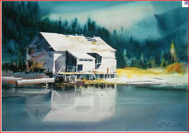
The above picture is one of many of Szabo's classic works. But, then again there are many who would say that almost all of his works were classics.
Let's take a close look at this painting. This work is an excellent study in values, and in simplicity of style.
The central subject in the work is the sunbathed cabin. Zsabo is a master of making colour work to his advantage, and he does it in part, by his firm knowledge of values.
The cabin achieves its drama not just because it is largely, unpainted white paper - but because 98% of it is surrounded by dark values. Contrast drives the white dramatically forward into your focus. And, if that isn't enough...the darkest values of all, are from the shade inside the cabin, and under the deck and from shadows, and here again we get the power of contrasting values. As the old laundry detergent jingo used to go..it all makes the "whites whiter than white".
The next thing about this work that catches my eye is its simplicity. There's not a lot of subject matter in this painting. There's the forest, the sky, the field, the lake and the cabin. He paints his sky first, then pulls the trees up into the nearly dry paper where his paint runs a bit and creates an intentional blur rending the forest undefineable. It's little more than the dark background canopy hanging from the back of the stage.
The sky is also a wet on wet exercise in simplicity. A couple of background swipes laid over a mixed wash. The dark shape on the upper right side of the page is a throw away. It's purpose is to box the picture in, and force your eye to look to the left.
That being said, we are left to look at the cabin and its reflection in the water.
There is a quote in the Bible of looking "through a glass darkly". Well, in this case the water mirrors the cabin. I would argue that because it presents an alternative, and a less than perfect replication of the cabin - the cabin's presence is strengthened for the third time. Without thinking much about it, the observor is really seeing a cabin twice the size it is. And since the reflected cabin is a little less distinct and a little darker, the actual cabin is intensified once again - this time by its own darker image.
Zsabo had a firm understanding that stength lies in simplicity. Complexity and visual competition of focus, distracts. Simplicity tightens the field of vision.
Not only do we see a painting of 5 elements; sky, forest, field, cabin and water
but we see Milton using a tremendous economy of brush strokes. Most of the painting that surrounds the cabin is painted with pretty simple washes.
The real close in brush work in this work is around the cabin, with its posts and porch, uprights, roof joists, and side boards.
The final element of simplicity worthy of note, is the power of his limited palette. This entire work is painted with variations of blue touched off with a few splashes of yellow tones. But looks at what he achieves! We find here the tremendous dominance of value over colour.
As they say in France, "All Roads lead to Paris." Step back from this work, and look at the sky the painter, puts a slash of light in the sky and this comes down almost to the right roof, and it is picked up again by the white cabin and dropped down into the reflection in the water. This simple slash in the sky puts the cabin inside a major path of whiteness. And if that isn't enough, another road of unpainted whiteness run along the shore up to the cabin's deck.
So here it is; Zoltan Szabo's art at its best. He knew how to make a little go a long, long way.
Loved reading this. Not sure why his name morphed from Zoltan to Milton .........
ReplyDeleteI knew him well and worked closely with Zoltan for a number of years. You have gotten his lessons well. His use of a limited palette was an important lesson. It assures color unity. Careful choices of those 5 or so pigments will produce a range of values and colors.
My apologies Willa on the name change. I had brain blip I guess. How could anyone forget the name of this great artist?
ReplyDelete